info@Web-SEO1.com
 Support
How Website Color Psychology Influences User Behavior and Brand Trust
Color Is a Powerful Design Tool in Modern Web Experiences
Color isn’t just visual decoration—it’s one of the strongest website color psychology tools in web design. The moment a visitor lands on a site, color influences their perception of trust, brand personality, and whether they feel comfortable engaging further. Studies consistently show that people form subconscious judgments about a website within seconds, and color plays a huge role in those split-second reactions.
For businesses building or redesigning their site in 2025, choosing the right colors can dramatically improve engagement and conversions. PMI’s All-Inclusive Web Design approach ensures color is used deliberately, not randomly.
How Colors Influence Emotional and Behavioral Responses
Every color creates an emotional reaction. These reactions can influence everything from how long a visitor stays on your site to whether they trust your brand enough to make contact or complete a purchase.
Common Color Associations
- Blue— trust, dependability, professionalism
- Green— balance, growth, nature, stability
- Red— urgency, passion, attention-grabbing
- Yellow— optimism, youth, creativity
- Black— luxury, authority, elegance
- White— simplicity, clarity, cleanliness
Understanding these associations helps businesses choose color palettes aligned with their brand identity.
Why Color Consistency Builds Brand Trust
Inconsistent colors or mismatched palettes make websites feel disorganized or unprofessional. Consistent brand colors across pages, buttons, headers, and imagery create cohesion—and users subconsciously associate consistency with credibility.
Consistency Helps Users:
- Recognize your brand quickly
- Feel confident navigating your website
- Trust that the business is polished and reliable
- Understand the hierarchy of information
Brand consistency is a core element of PMI’s Brand Identity Design service, ensuring websites feel purposeful and unified.
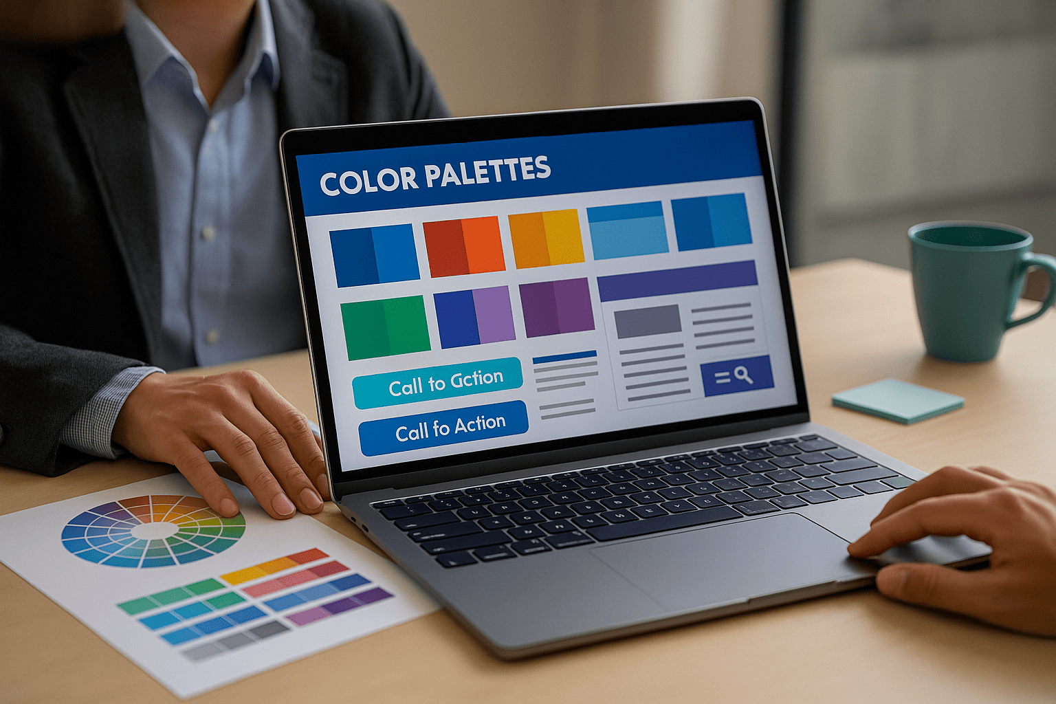
How Color Guides User Actions (CTA Psychology)
Strategic color choices help guide users toward key actions, such as clicking a button, submitting a form, or exploring a service page. Call-to-action (CTA) buttons should stand out—while still aligning with the brand palette.
Qualities of Effective CTA Colors
- High contrast against the background
- Easily noticeable without being overwhelming
- Consistent across the site
- Embodying the desired feeling (trust, urgency, encouragement)
A well-designed CTA color can significantly increase conversions.
Accessibility: The Overlooked Side of Color Psychology
Color isn’t just about aesthetics or emotion—it’s also essential for accessibility. Poor contrast makes text difficult to read, especially on mobile devices or for users with visual impairments.
Accessibility Best Practices
- Use contrast ratios that meet WCAG standards
- Avoid placing similar shades together
- Ensure CTA buttons are distinguishable
- Don’t rely on color alone to convey meaning
PMI incorporates accessibility into every project through its Small Business SEO and UX strategies to help websites perform better across all audiences.
How to Choose the Right Colors for Your Website
Selecting the right color palette should start with brand personality, industry expectations, and the emotional response you want users to feel.
Smart Color Selection Tips
- Start with 1–2 brand colors, then build a palette around them
- Use accent colors sparingly to draw attention
- Keep backgrounds light or neutral for readability
- Test color combinations across desktop and mobile
- Review competitor palettes to differentiate your brand
A well-planned palette strengthens message clarity and improves user experience.
The Bottom Line: Color Psychology Shapes User Behavior
Color influences everything from brand trust to user engagement. Businesses that understand the psychology behind color can guide visitors more effectively, build stronger brand recognition, and create a more enjoyable browsing experience. In 2025, thoughtful color selection is no longer optional—it’s a key component of high-converting web design. PMI (Power Marketing International) understands the importance of using the right colors for your website. Learn more about PMI by visiting their website https://web-seo1.com.